Ah, the old landing page. Every website has then, but not everyone does them well. At Ah So, we believe these pages should all do several things:
1. Clear and Emphasized Call To Action:
- Should convert viewers into customers
- Set offer copy and the call to action from rest of the page to make it special
- The best call to actions are in plain English with no more than 7 – 12 words
2. Plenty of White Space
- Visitors don’t read; they scan the text for relevancy to their goal(s).
- Clean design helps emphasize key message.
3. Visually Engage the User
- Tell the story with impactful imagery rather than lengthy copy
4. Simplify the Design and Reduce Text
- Don’t use a wide variety of fonts/colors on the page
- Bland landing pages are often the ones offering the best conversion
- Minimize distractions
- Simple headlines and short bullet lists
5. Use Images Judiciously
- Should be visual candy & orient visitor to product or headline
- Use a caption
- Renders properly and is sized correctly
Great landing pages aren’t easy to come by, but a here are two examples of great landing pages we have created.
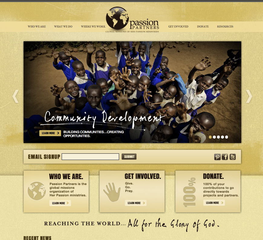
This is only part of the page, but through the slider, we showcase the main themes of the site, the projects of Passion Partners. Underneath the slider, we enable users to quickly and effectively engage with Passion Partners social media channels, and then call attention to the main goals of the site: understanding the goals of Passion partners getting involved, and donations.
Please view the entire Passion Partners site.
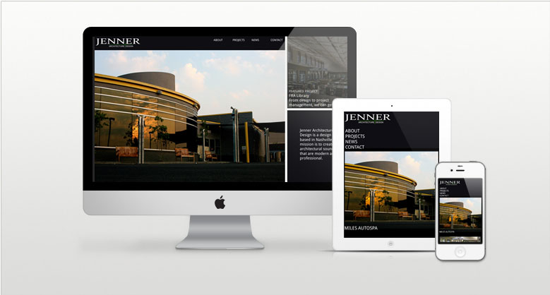
Another great landing page we created was for Jenner Designs. Jenner is a local architect whose sole purpose is to show off his work. The question then emerged if he needed all social integration and calls to action like we did on the Passion Partner’s site. The answer was simple, no! Let’s check the design on several screens and send it through our checklist:
Does the Jenner site incorporate:
A Clear and Emphasized Call To Action: Yes, see the latests projects
Plenty of White Space: No, but with a full width image background, it doesn’t need it
Visually Engage the User: Yes, tells how Jenner designs his projects
Simplify the Design and Reduce Text: Yes, the site is actually build so Jenner can not add a lot of text so that his pictures remain front and center of the design.
Use Images Judiciously : Yes, With great photography from Jenner’s projects, we were able to highlight the uniqueness of the projects they have worked on
View the Jenner Design site.
Are there things that we left off that you usually include in your landing page designs? Please let us know in the comments below.


